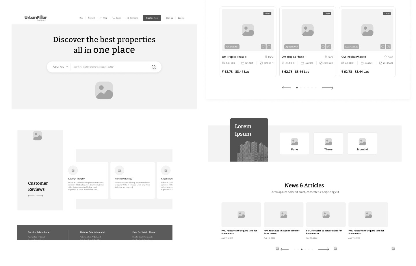
Urban Pillar is a thoughtfully designed real estate platform created with a user-centric approach. The design process followed a structured methodology encompassing user research, journey mapping, wireframing, and high-fidelity prototyping. Emphasis was placed on intuitive navigation, responsive layouts, and visual hierarchy to enhance discoverability and drive engagement. The project leveraged best practices in usability, accessibility, and design systems to ensure a seamless and consistent digital experience across devices. The result is a streamlined interface that not only showcases properties effectively but also simplifies the home-buying journey for users.
Designed a user-centric real estate platform with intuitive navigation, responsive layouts, and clean visual hierarchy to enhance property discovery and user trust.

Problem Statement & Why Urban Pillar
Many real estate websites today suffer from cluttered interfaces, overwhelming filters, and poor mobile responsiveness, making property discovery tedious and frustrating for users.
Urban Pillar was designed to solve these issues by offering a clean, intuitive, and user-first experience. By analyzing competitor platforms, we focused on simplifying the property search journey, streamlining content hierarchy, and ensuring consistency across devices. The result is a seamless and engaging platform that builds user trust while making home-finding easier and more efficient.

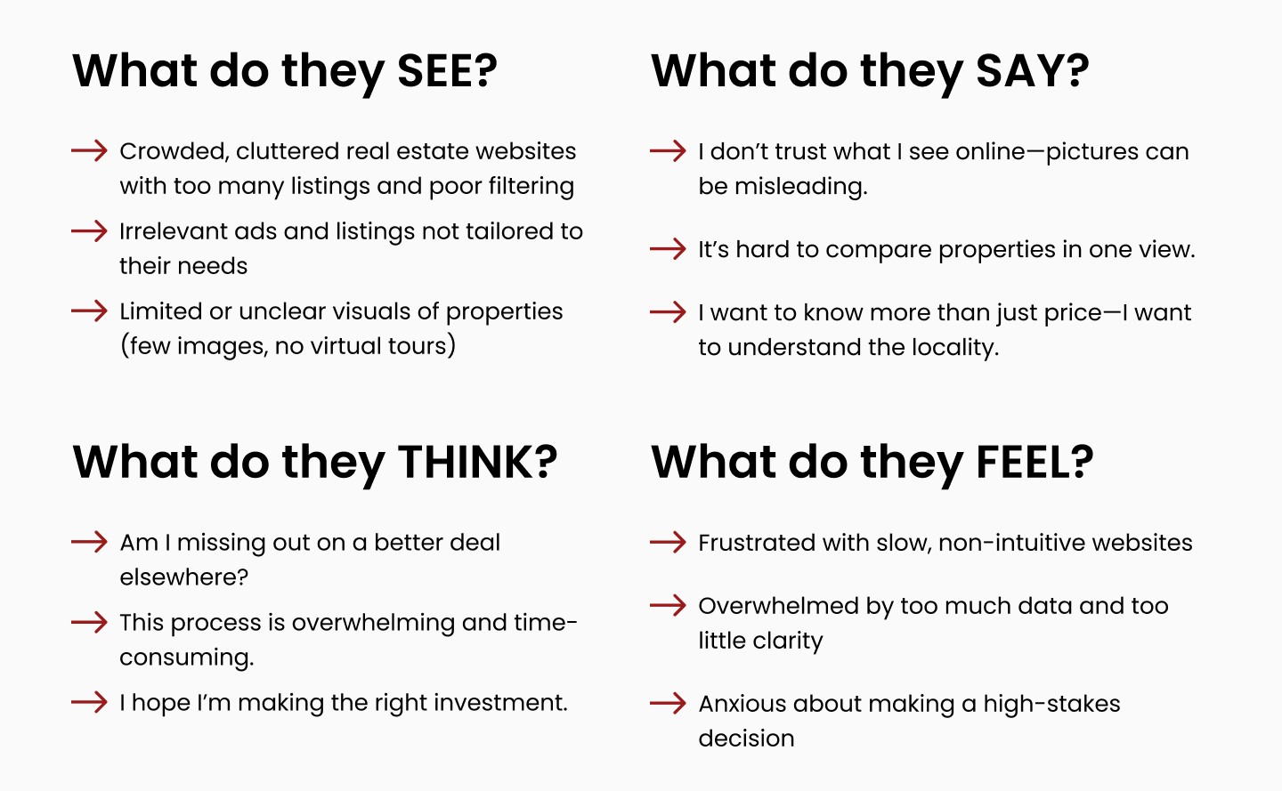
Empathy Mapping Urban Pillar Website Users
Here’s a complete Empathy Map for Urban Pillar real estate website project. This helped me to deeply understand my users and paved the way to design with their thoughts, feelings, and challenges in mind.
Eisenhower Matrix
To prioritize tasks effectively and accelerate decision-making, we applied the Eisenhower Matrix during the project. This helped us categorize actions based on urgency and importance, ensuring that critical user experience enhancements were addressed promptly without compromising on design quality.

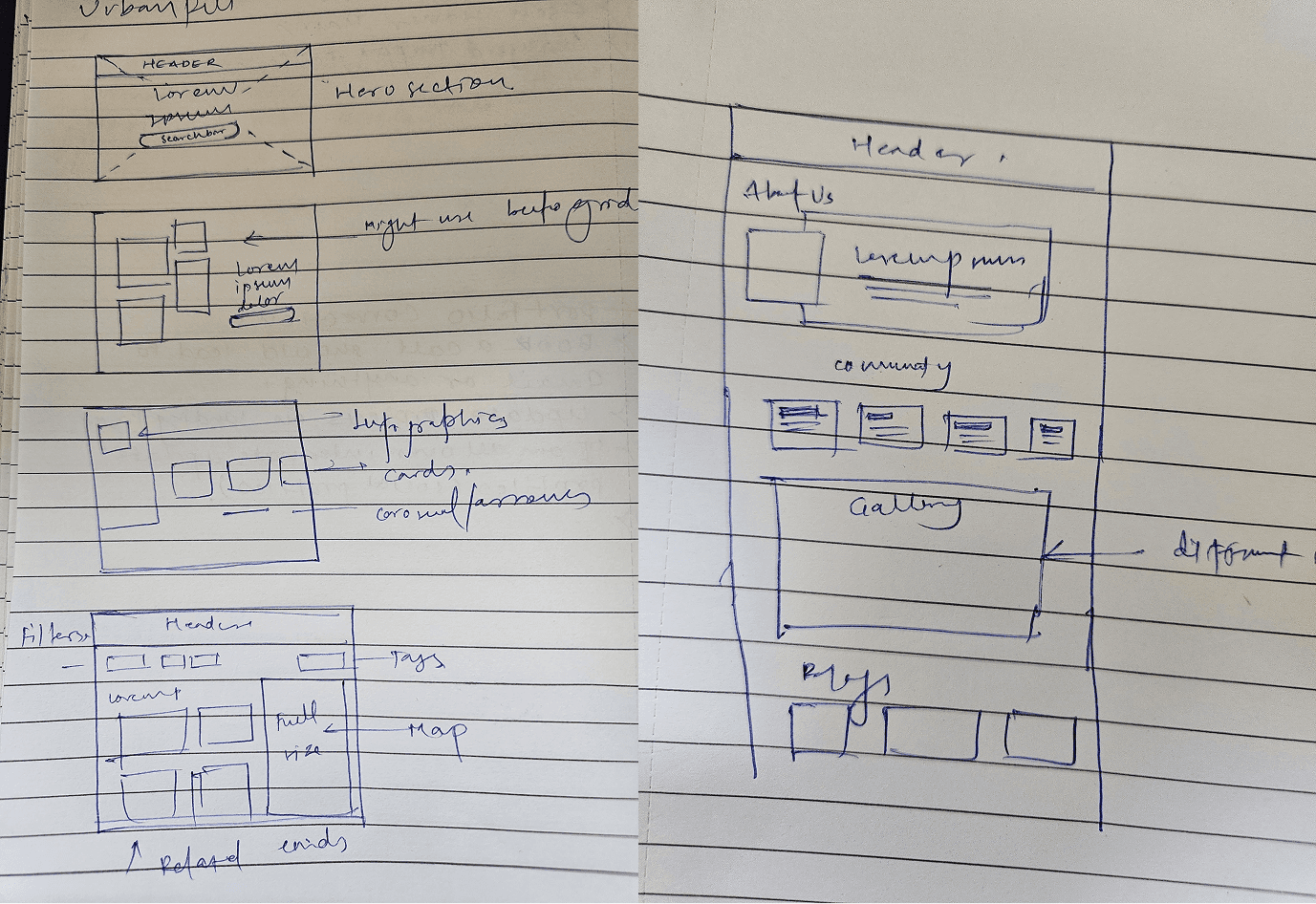
Wires for UrbanPillar
Designing wireframes for the UrbanPillar real estate website came with a set of practical challenges. One of the initial hurdles was organizing a large amount of property-related data in a clean and user-friendly layout without overwhelming the user. Balancing visual hierarchy with usability required multiple iterations. Another key challenge was ensuring the design stayed consistent while accommodating various user journeys—from first-time visitors to returning buyers. I addressed these by regularly testing low-fidelity wireframes, gathering feedback, and applying UX principles such as information prioritization, intuitive navigation, and responsive layout adjustments. Gradually, with continuous refinement and a user-centered approach, the wireframes evolved into a structure that was both functional and visually aligned with the brand goals.
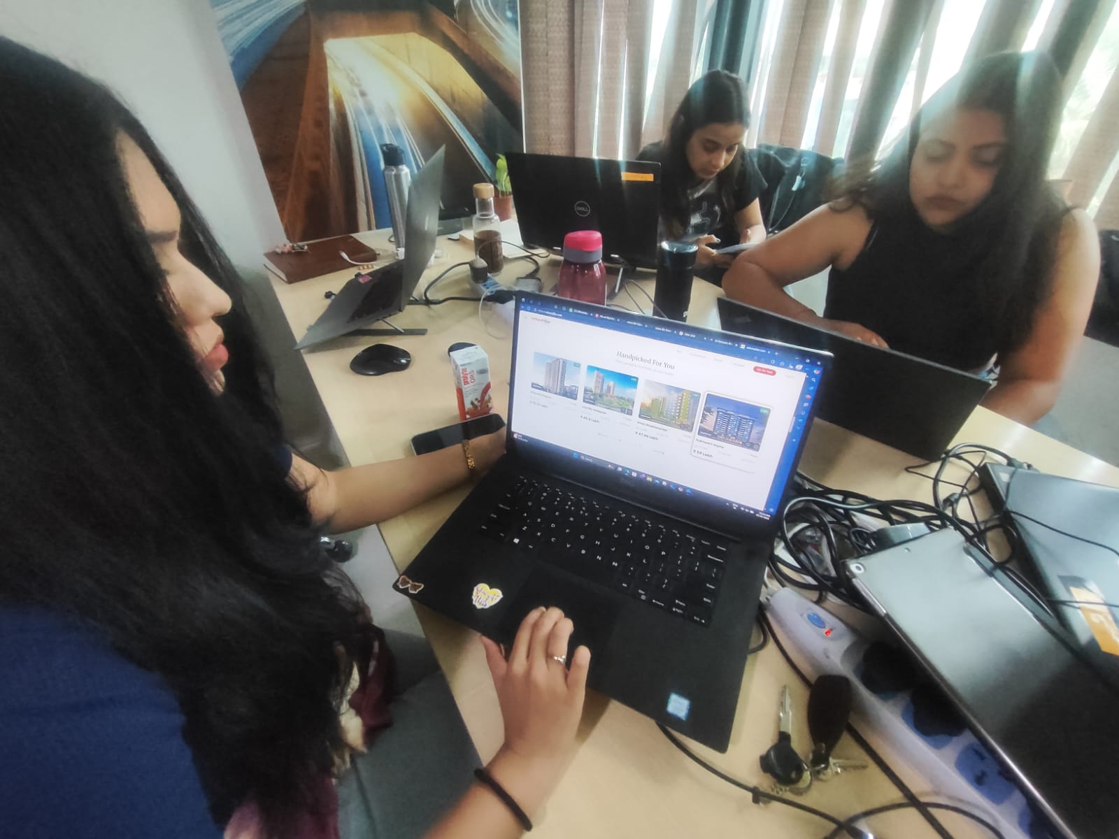
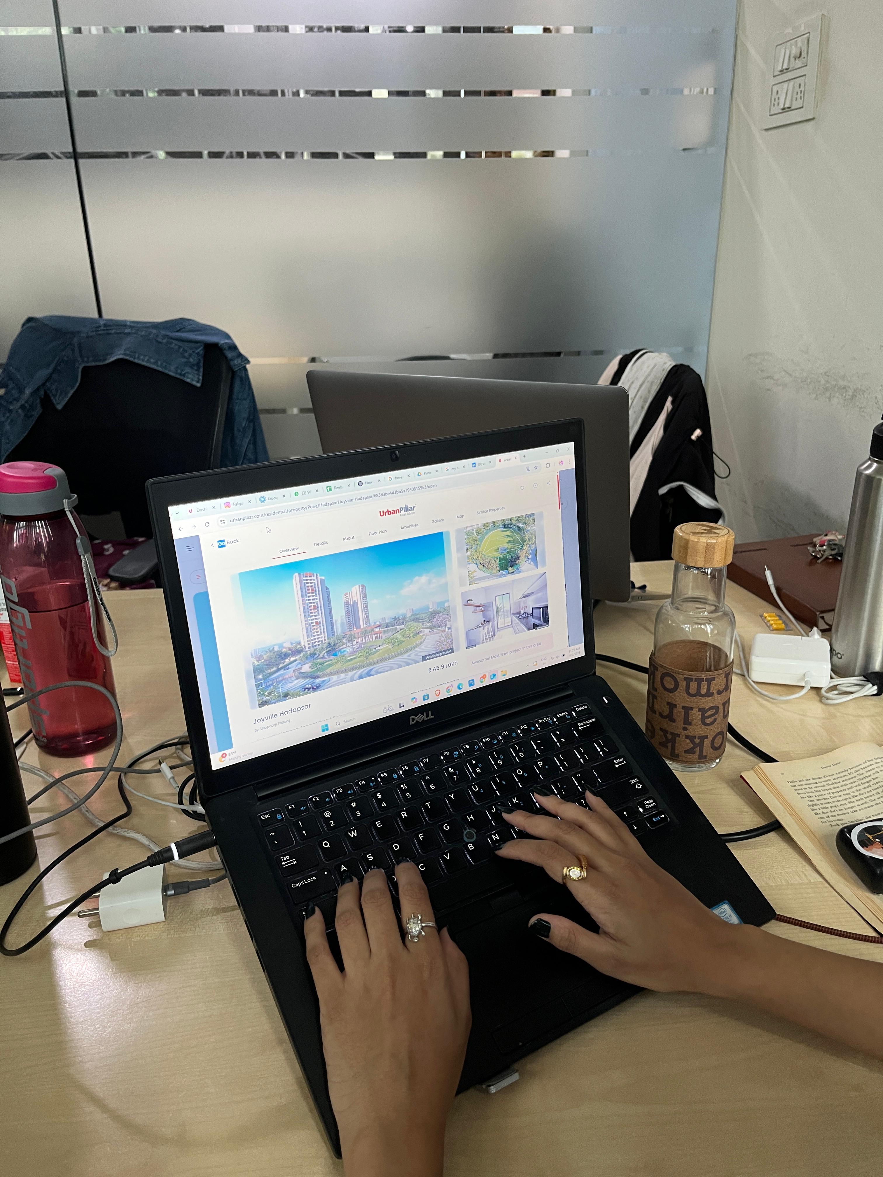
Usability Testing
Now, I've conducted the UT to demonstrate how my design decisions were validated through direct user feedback, and how I could iterated to improve user experience.
The goal of the usability testing phase was to identify pain points in user navigation, measure task completion efficiency, and validate the clarity of core features like property search and filter systems.
How did I conduct the same?
I conducted a moderated in-person usability test with 5 participants, asking them to complete tasks such as finding a 2BHK flat under 70 lakhs, booking a site visit, and comparing properties. The test was done on the prototype using Figma.

Key Findings
Users couldn’t easily locate the "Compare Properties" feature.
Filters were not intuitive and required too many clicks.
Confusion between “Enquire Now” and “Book Site Visit” CTAs.
Actions Taken
Based on the feedback, I moved the "Compare" option to a more visible sticky section, redesigned the filter panel for quicker access, and clarified CTAs by using distinct iconography and tooltips.
Usability testing played a crucial role in refining the user journey for Urban Pillar. Through structured tasks and real-user feedback, I was able to pinpoint friction areas and deliver design iterations that improved clarity, efficiency, and user confidence. This not only optimized the flow but ensured the platform met user expectations and industry benchmarks for real estate web UX.
Competitive Analytics Review
As part of the research phase, I analyzed traffic patterns, bounce rates, and engagement metrics from key competitors using platforms like SimilarWeb and Ubersuggest. The insights highlighted high drop-off rates on listing pages and lengthy navigation to booking CTAs. This informed my decision to simplify property filters, reduce scroll depth, and create sticky action buttons on Urban Pillar.
Header 1 | Header 2 | Header 3 | ||
|---|---|---|---|---|
99acres | 2m 30s | 58% | 4.2 | Organic Search |
Magicbricks | 3m 05s | 52% | 5.1 | Direct+Organic |
NoBrocker | 2m 10s | 60% | 3.9 | Referral+Paid |
Insights
I have used "Similarweb" for the referral analysis.


These insights guided strategic UX decisions, optimizing navigation flow and enhancing user retention.